Chart
If you select the Chart label, you can have the pivot table under the pivot chart and explore the data interactively.
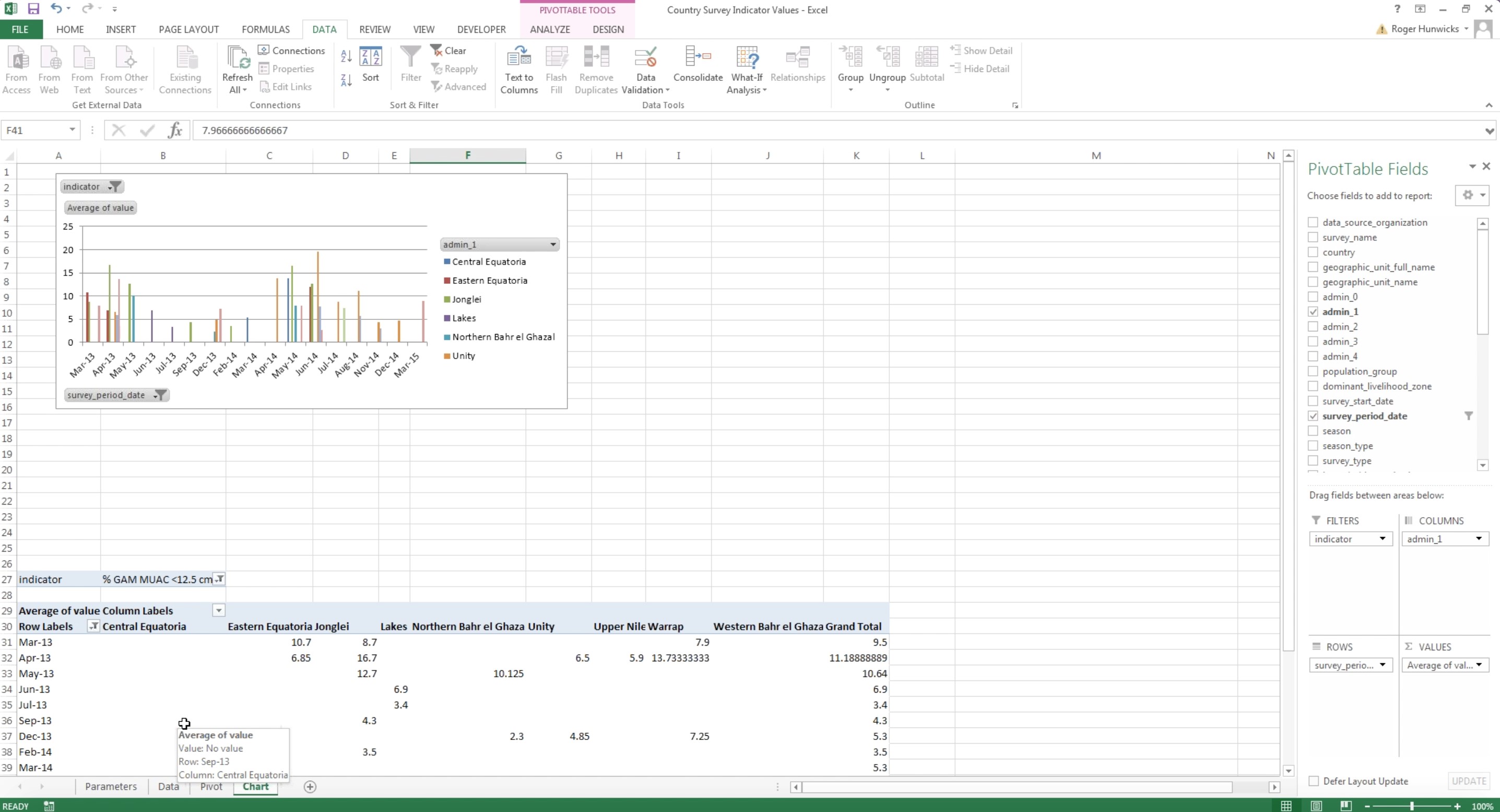
Figure 24. Chart on a Refreshable Nutrition Workbook
For example you can take out the ‘Admin unit’ value out of the equation and look at a straight measure. If looking at a straight measure, you can select a specific measure as it is shown in figure 36. You may easily change the indicator and choose the period date, or select one single data series or multiple data series. You can customize the chart from the right hand side ‘Pivot table fields’ shown in Figure 35 in various ways, depending on what it is useful for your specific analysis.
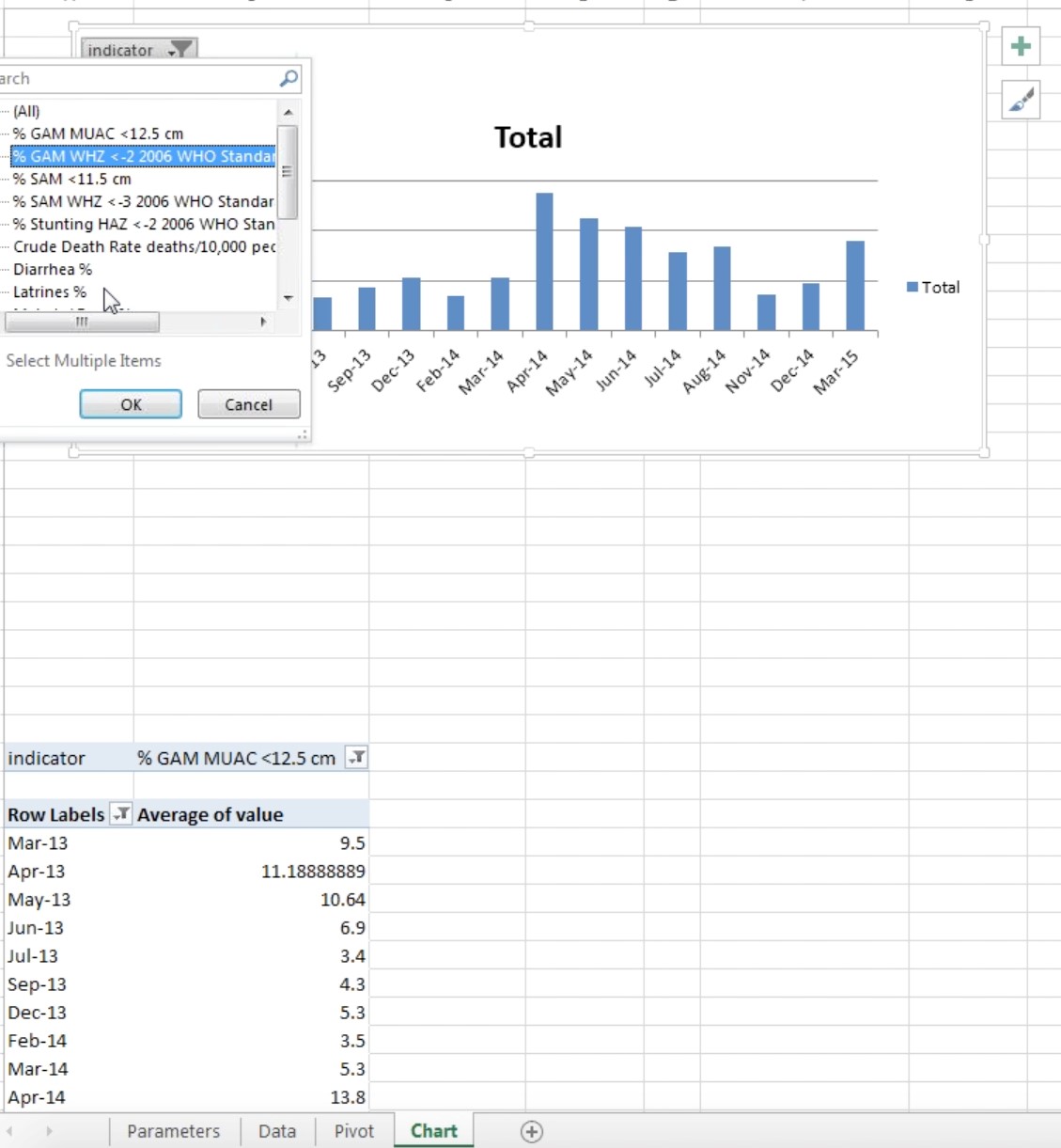
Figure 25. Chart measure selection
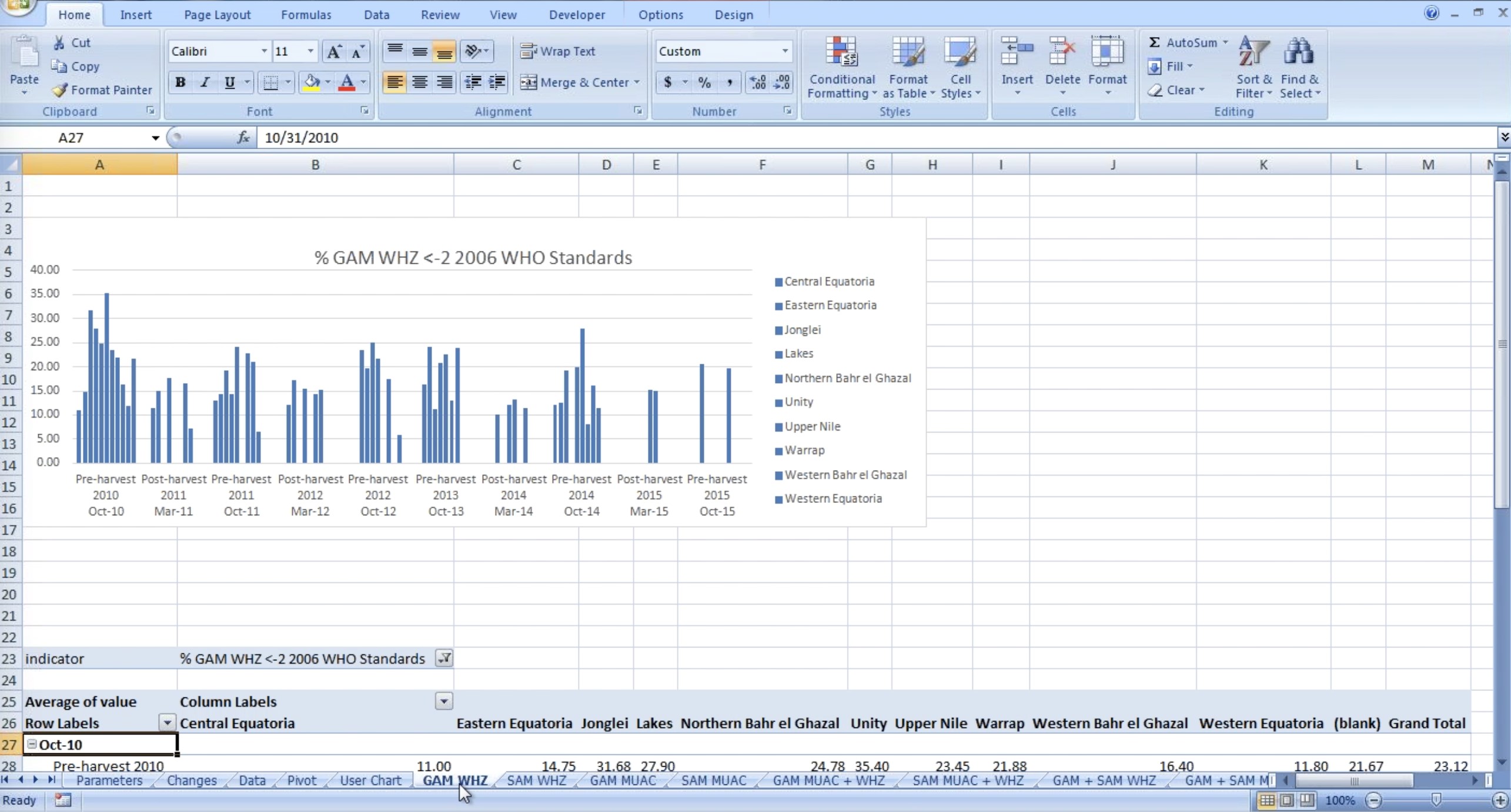
Figure 26. Spreadsheets Labels on a Nutrition Workbook
The tab names represent the various spreadsheets on a Nutrition Workbook. In the example above the data is represented by region. Here it shows one indicator for Admin 1 Unit as a series.
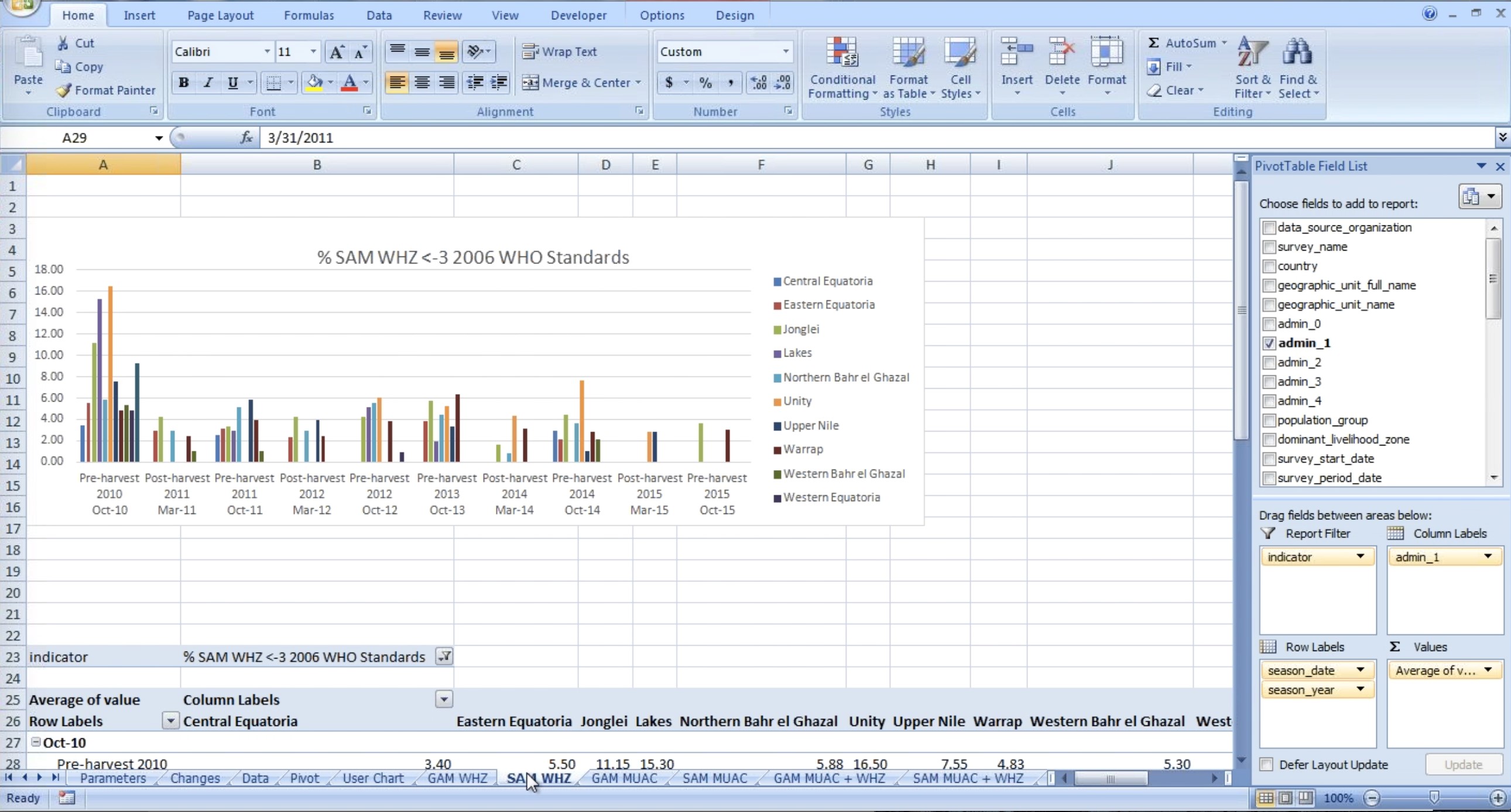
Figure 27. SAM WHZ Spreadsheet data cluster on a Nutrition Workbook
This figure shows another spreadsheet within the same nutrition workbook and
it is grouped by season. Where there is a gap it is because there is not any
data available. The approximate date under the chart is based on the typical
season for the country. To put them effectively in chronological order in
excel, the only way we can cluster data is, by having some date that we can
tie data to, so we give it a label of ‘pre-harvest 2010’ but the date is
normally tied to its 31st Oct 2010.
If you want to look at the national average by season instead of the regional
average, you can go to the Pivot Table Field List on the right hand of the
screen and choose the relevant fields to add to the report. By taking Admin 1
out of the column labels box you would then get the national average.
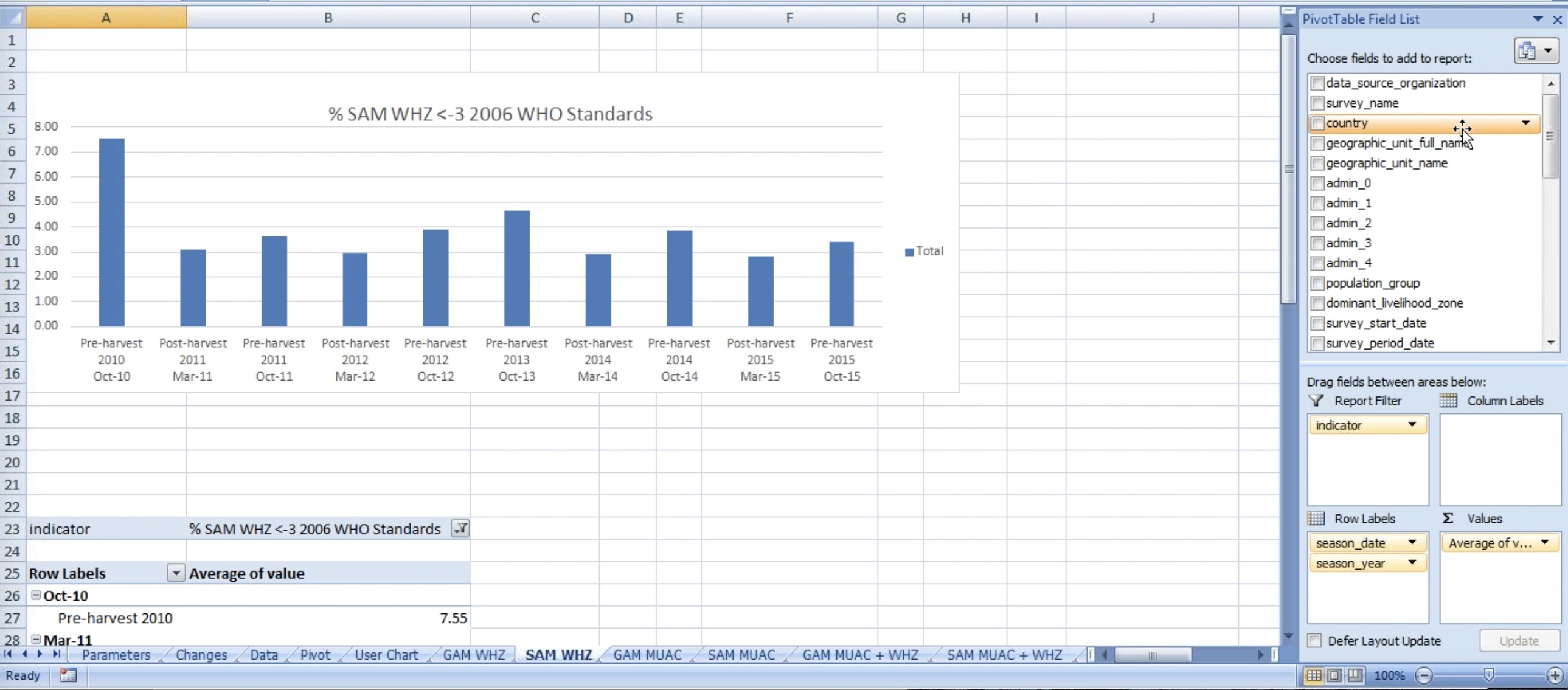
Figure 28. National average set up from Pivot Table Field List in SAM WHZ Chart
Similarly you can drag Admin 2 in column labels if you wanted to look at the data at that level. To select unity state in Admin level 1, you can right click over admin 1 and select ‘Unity’ from the drop down list.
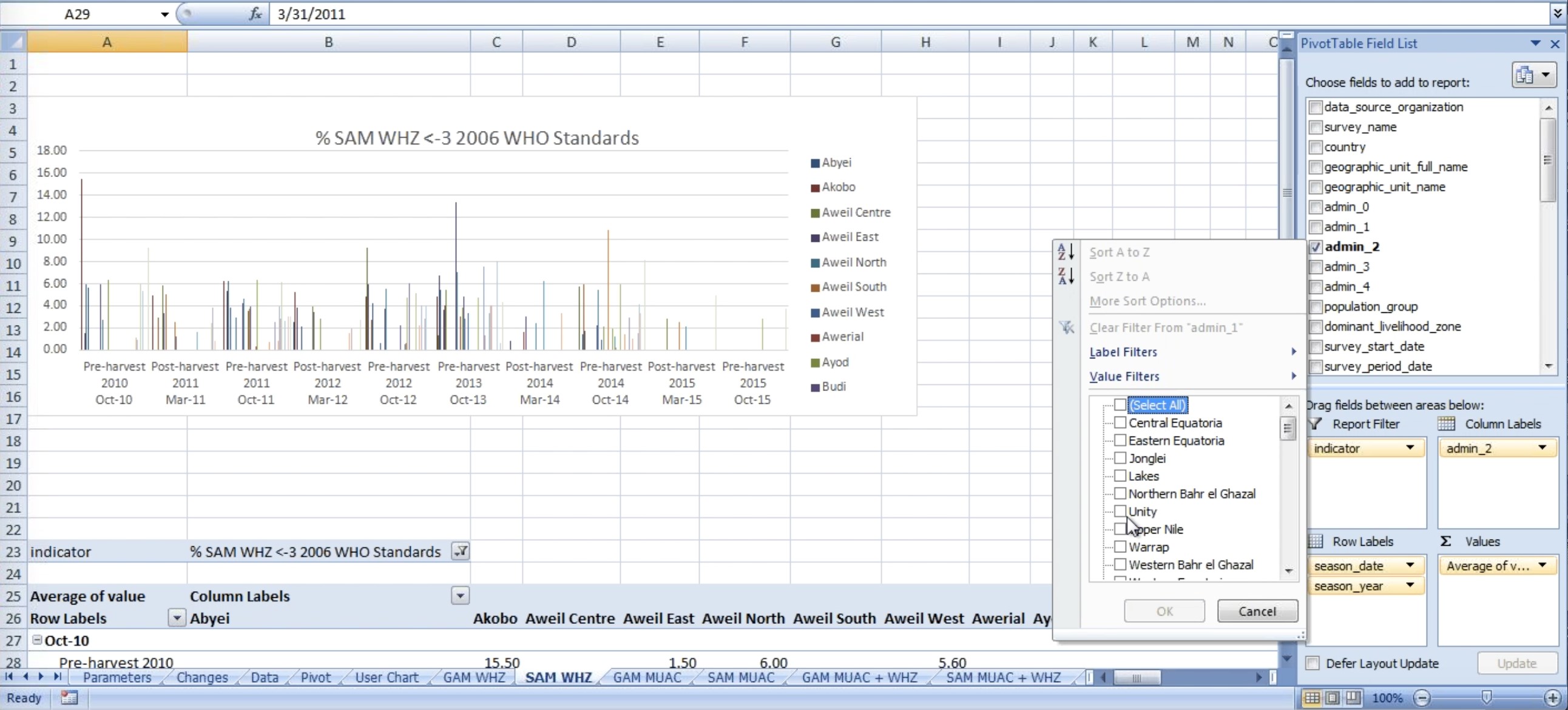
Figure 29. Admin 2 level average set up from Pivot Table Field List in SAM WHZ Chart
You can drag admin 1 to ‘Report Filter’ box and the chart will be represented as shown below:
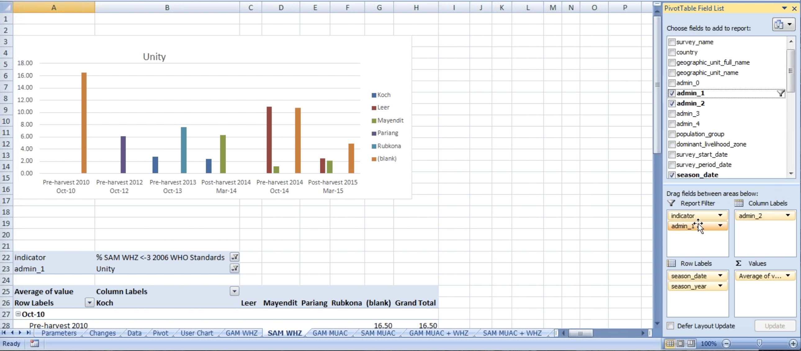
Figure 30: Admin 1 Under Report Filter in SAM WHZ Chart
Similarly you can drag admin 1 from Report Filter to Column labels and perhaps filter for two admin 1 at the same time and still look at Admin 2. It would vary from country to country and report to report. Manipulation is quite flexible.
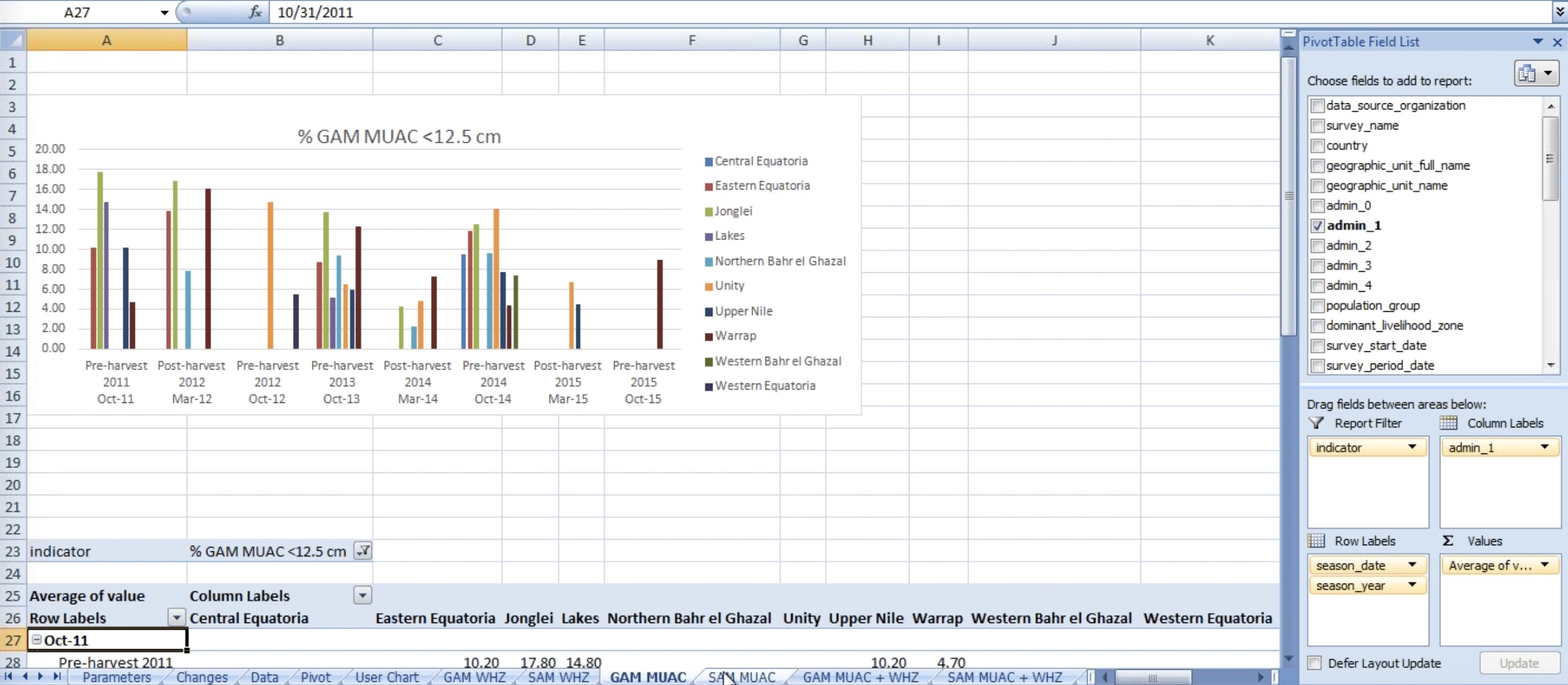
Figure 31: GAM MUAC Spreadsheet Chart
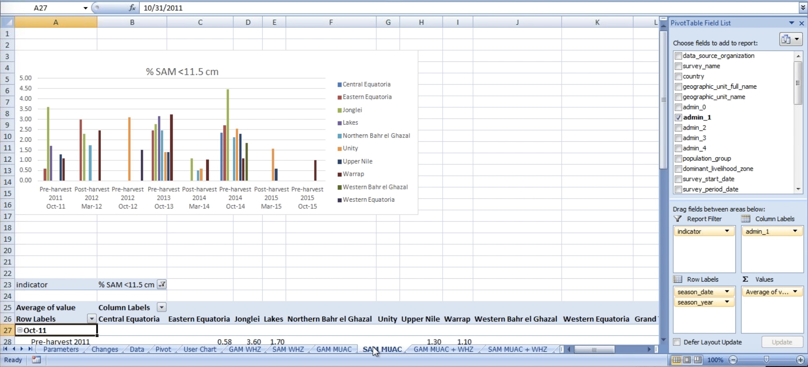
Figure 32: SAM MUAC Spreadsheet Chart
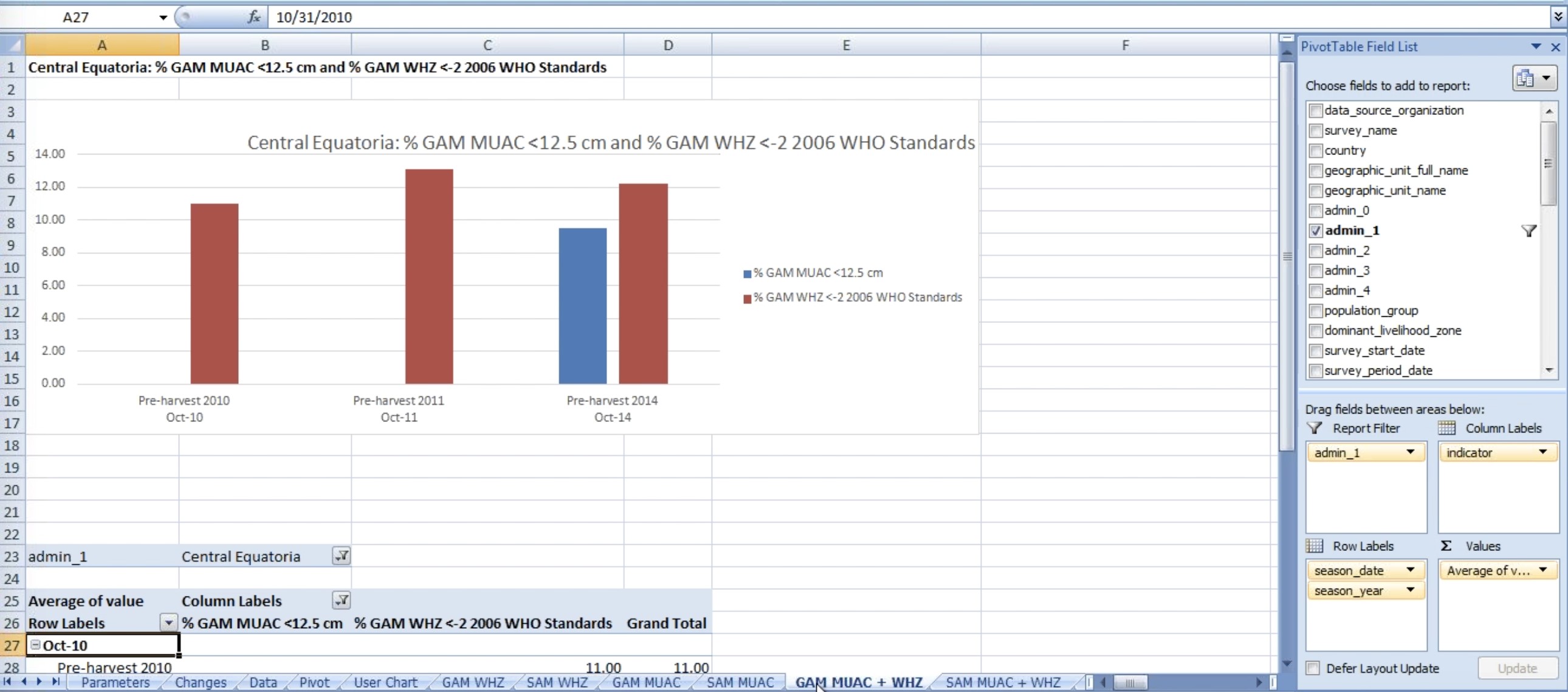
Figure 33: GAM MUAC + WHZ indicators on a Spreadsheet Chart
When looking at two indicators at ones, you only need to do so according to one geographic unit. In addition, the tittles from the charts update automatically.
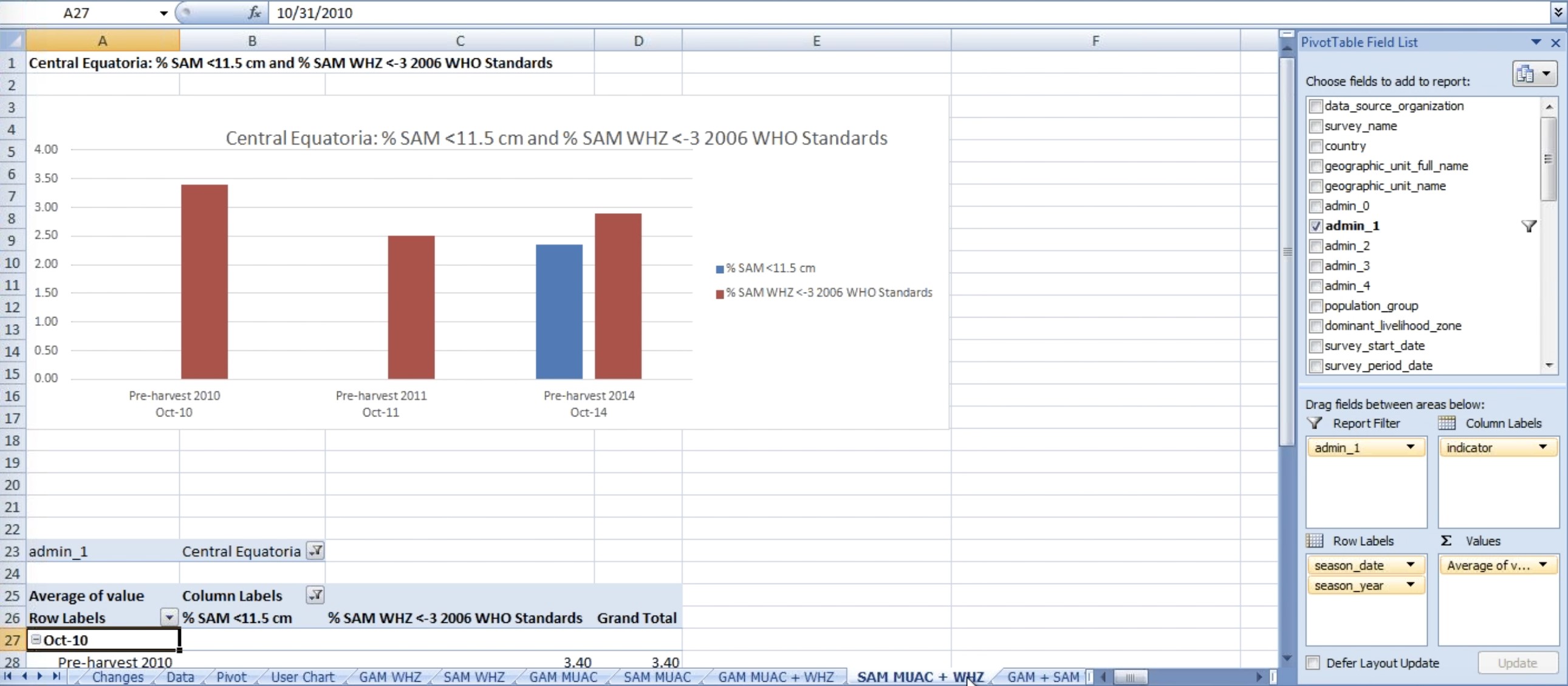
Figure 34: SAM MUAC + WHZ indicators on a Spreadsheet Chart
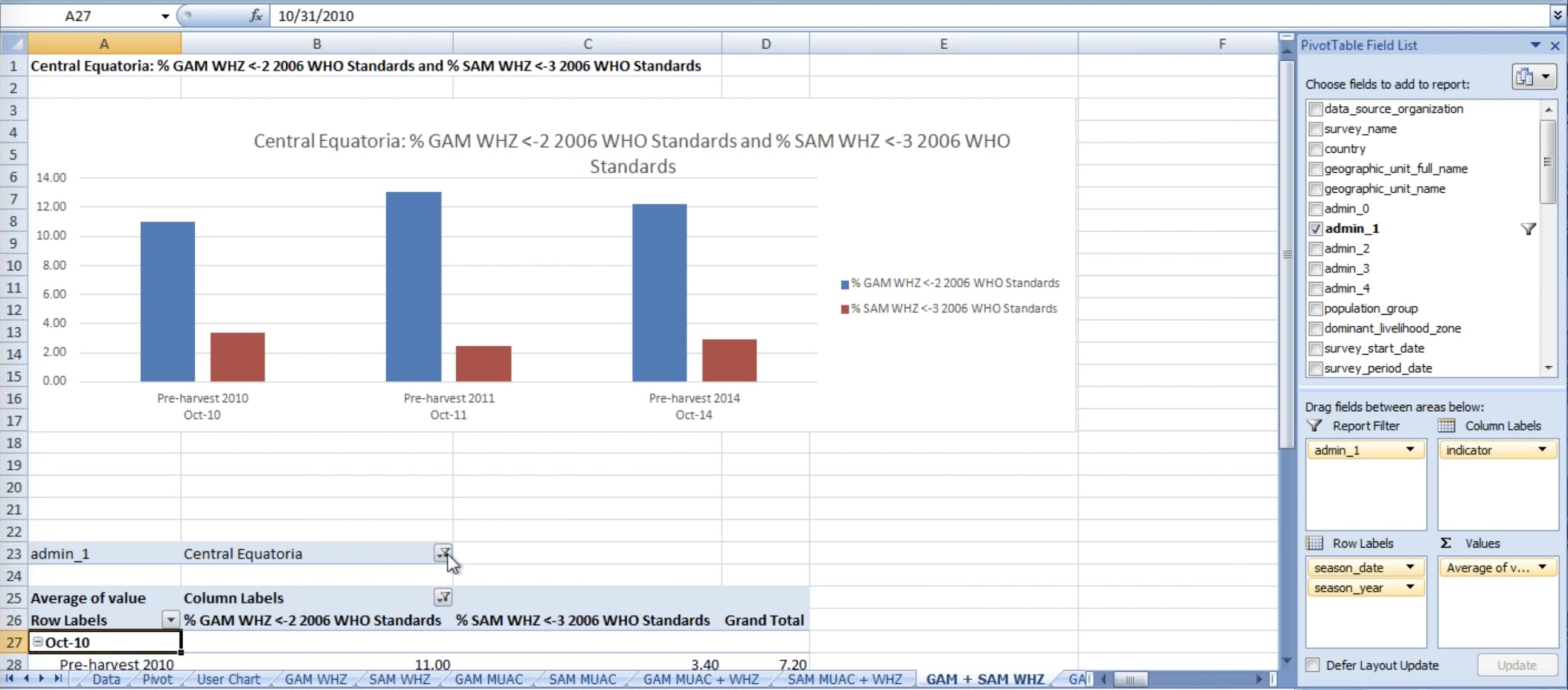
Figure 35: GAM +SAM WHZ indicators on a Spreadsheet Chart
Figure 36: GAM +SAM WHZ indicators by Unity on a Spreadsheet Chart
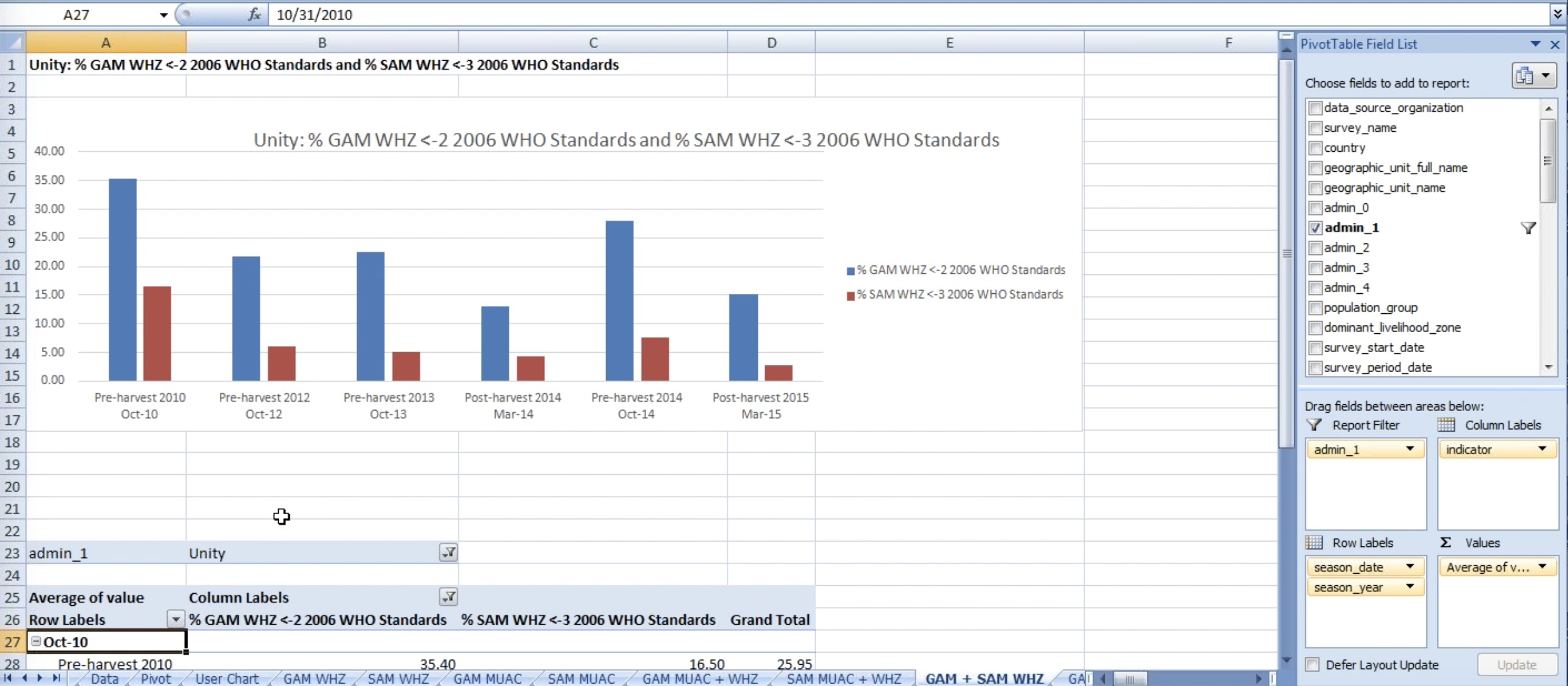
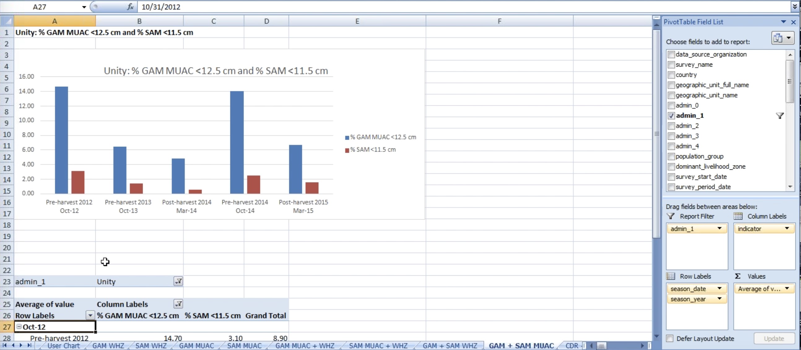
Figure 37: GAM +SAM MUAC indicators by Unity on a Spreadsheet Chart
Note the dates under the chart, (Oct-12, Oct-13, Mar-14, Mar-15) represent the end of the season.
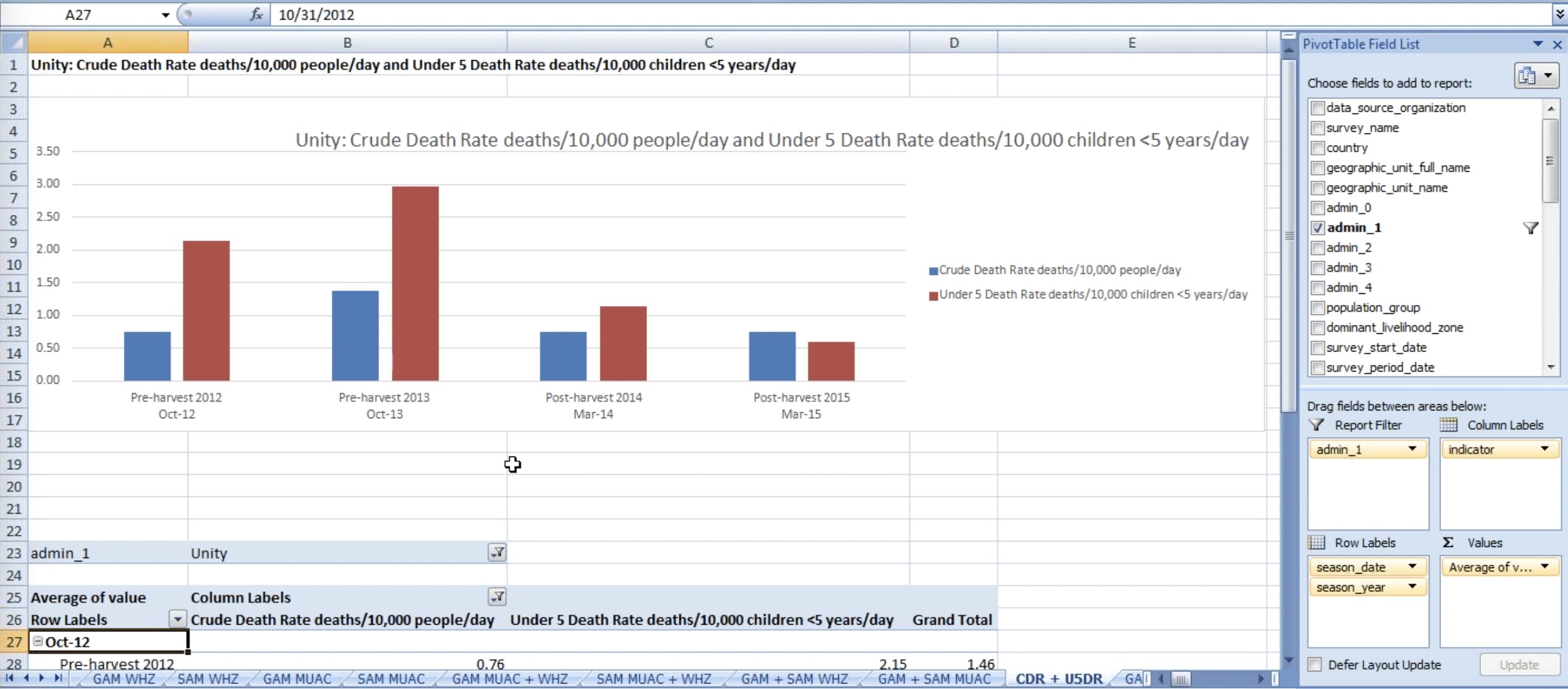
Figure 38: CDR+ U5DR indicators by Unity on a Spreadsheet Chart
These are averages for all surveys in Unity state. The number of data points that represent this average cannot be seen. However you can find out at the number of surveys by clicking in one of the numbers from the table under the graph as shown below.
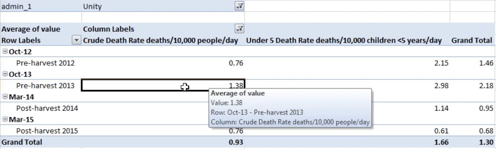
Figure 39: Double Click a Number
If you double click a number, a new Spreadsheet will be created on the Workbook with the Survey series dates that were use to calculate that number as shown below:
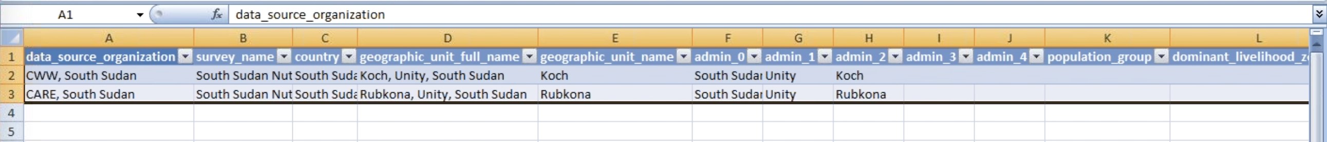
Figure 40: No. of Surveys after the double click
Unfortunately there is no way to find out how much data contributed to the number. (next sprint meeting discussion)
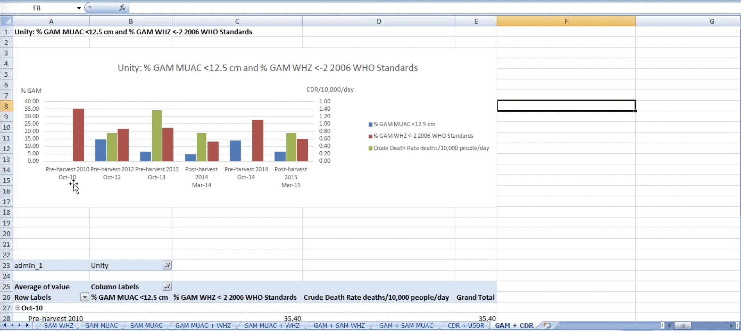
Figure 41: GAM + CDR indicators on a Spreadsheet Chart
CDR is in green and the other two indicators, GAM MUAC and GAM WHZ, are in blue and red. GAM is on the left Y-axis, and CDR is on the right Y-axis. If you want to look at GAM according to weight for high season score and not to MUAC, you can click the filter button shown below and un-check what you do not want on the Chart.
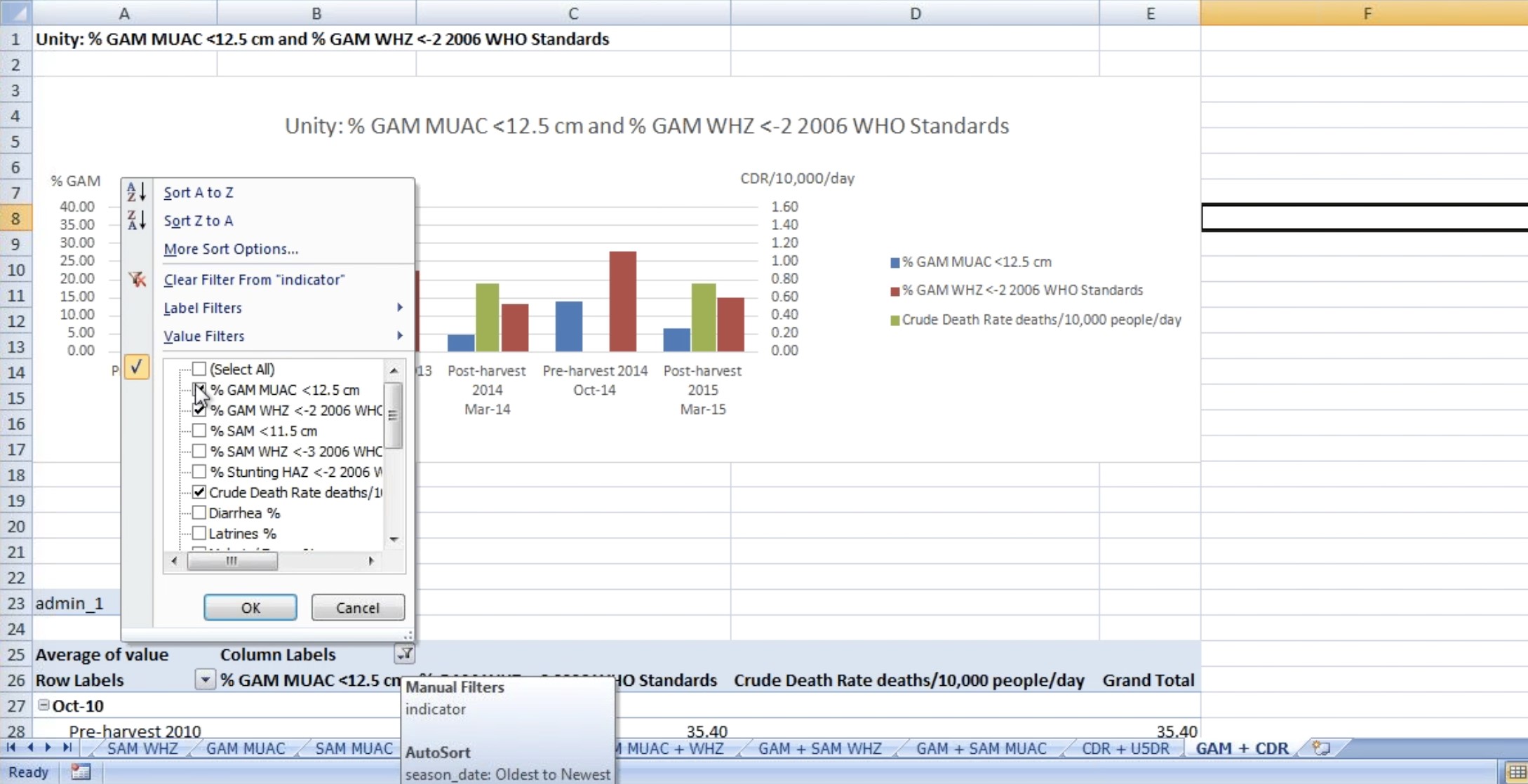
Figure 42: Un-check GAM MUAC from the Filter
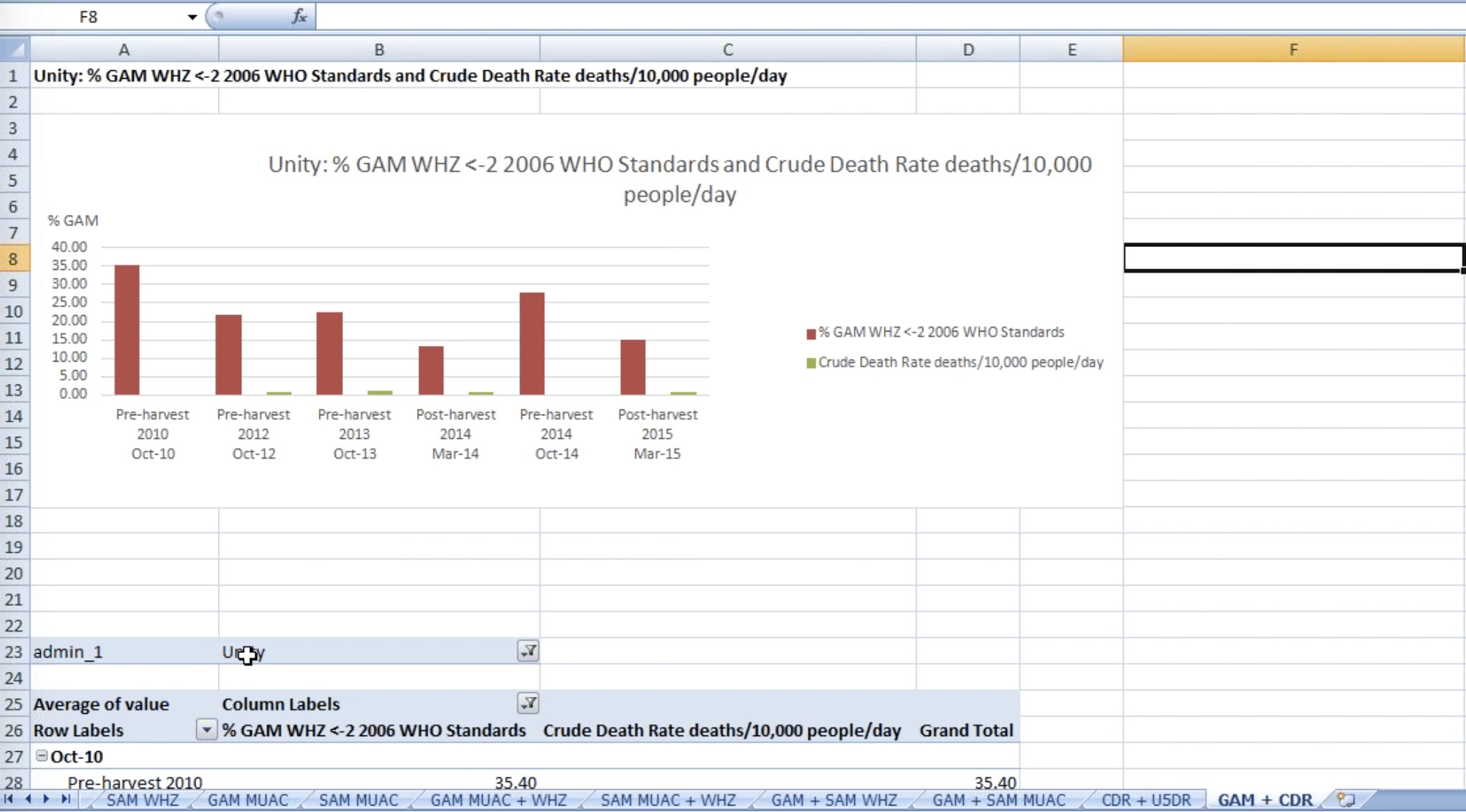
Figure 43: Chart with GAM MUAC unchecked
The right Y-axis is lost (to be discussed on next Sprint Meeting)
You can copy the chart on a new Spreadsheet and play with the filter settings to create a new graph with different data mixing data, as you may need.